Python Scikit-learn: Create a box plot which shows the distribution of quantitative data in a way that facilitates comparisons between variables or across levels of a categorical variable of iris dataset
Python Machine learning Iris Visualization: Exercise-15 with Solution
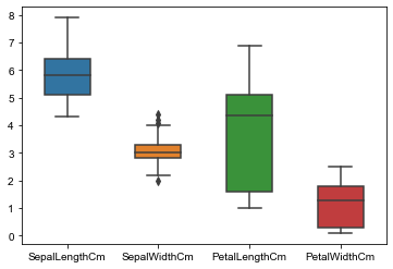
Write a Python program to create a box plot (or box-and-whisker plot) which shows the distribution of quantitative data in a way that facilitates comparisons between variables or across levels of a categorical variable of iris dataset. Use seaborn.
Sample Solution:
Python Code:
import pandas as pd
import seaborn as sns
iris = pd.read_csv("iris.csv")
#Drop id column
iris = iris.drop('Id',axis=1)
box_data = iris #variable representing the data array
box_target = iris.Species #variable representing the labels array
sns.boxplot(data = box_data,width=0.5,fliersize=5)
sns.set(rc={'figure.figsize':(2,15)})
Sample Output:
Go to:
NEXT : Write a Python program to create a Principal component analysis (PCA) of iris dataset.
Python Code Editor:
Have another way to solve this solution? Contribute your code (and comments) through Disqus.
What is the difficulty level of this exercise?