Pandas Datetime: Timewheel of Hour Vs Year comparison of the top 10 years in which the UFO was sighted
25. Timewheel: Hour vs. Year Comparison for Top 10 UFO Years
Write a Pandas program to create a Timewheel of Hour Vs Year comparison of the top 10 years in which the UFO was sighted.
Sample Solution:
Python Code:
import pandas as pd
import matplotlib.pyplot as plt
import matplotlib as mpl
import matplotlib.cm as cm
#Source: https://bit.ly/2XDY2XN
df = pd.read_csv(r'ufo.csv')
df['Date_time'] = df['Date_time'].astype('datetime64[ns]')
most_sightings_years = df['Date_time'].dt.year.value_counts().head(10)
def is_top_years(year):
   if year in most_sightings_years.index:
       return year
month_vs_year = df.pivot_table(columns=df['Date_time'].dt.month,index=df['Date_time'].dt.year.apply(is_top_years),aggfunc='count',values='city')
month_vs_year.index = month_vs_year.index.astype(int)
month_vs_year.columns = month_vs_year.columns.astype(int)
print("\nComparison of the top 10 years in which the UFO was sighted vs each month:")
def pie_heatmap(table, cmap='coolwarm_r', vmin=None, vmax=None,inner_r=0.25, pie_args={}):
   n, m = table.shape
   vmin= table.min().min() if vmin is None else vmin
   vmax= table.max().max() if vmax is None else vmax

   centre_circle = plt.Circle((0,0),inner_r,edgecolor='black',facecolor='white',fill=True,linewidth=0.25)
   plt.gcf().gca().add_artist(centre_circle)
   norm = mpl.colors.Normalize(vmin=vmin, vmax=vmax)
   cmapper = cm.ScalarMappable(norm=norm, cmap=cmap)

   for i, (row_name, row) in enumerate(table.iterrows()):
       labels = None if i > 0 else table.columns
       wedges = plt.pie([1] * m,radius=inner_r+float(n-i)/n, colors=[cmapper.to_rgba(x) for x in row.values],
           labels=labels, startangle=90, counterclock=False, wedgeprops={'linewidth':-1}, **pie_args)
       plt.setp(wedges[0], edgecolor='grey',linewidth=1.5)
       wedges = plt.pie([1], radius=inner_r+float(n-i-1)/n, colors=['w'], labels=[row_name], startangle=-90, wedgeprops={'linewidth':0})
       plt.setp(wedges[0], edgecolor='grey',linewidth=1.5)
plt.figure(figsize=(8,8))
plt.title("Timewheel of Hour Vs Year",y=1.08,fontsize=30)
pie_heatmap(month_vs_year, vmin=-20,vmax=80,inner_r=0.2)
Sample Output:
Comparison of the top 10 years in which the UFO was sighted vs each month:
C:\Users\User\Anaconda3\lib\site-packages\matplotlib\colors.py:512: RuntimeWarning: invalid value encountered in less
  xa[xa < 0] = -1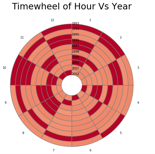
For more Practice: Solve these Related Problems:
- Write a Pandas program to extract UFO sighting data for the top 10 years and create a timewheel chart comparing hours versus years.
- Write a Pandas program to generate a circular plot that maps the observation hours against the top 10 UFO years.
- Write a Pandas program to visualize the hourly distribution of UFO sightings for the top 10 years using a polar bar chart.
- Write a Pandas program to create a pivot table summarizing UFO sightings by year and hour for the top 10 years and plot it as a timewheel.
Go to:
PREV : Heatmap for Top 10 UFO Years vs. Each Month.
NEXT : Pandas Resampling and Frequency Conversion Exercises Home.
Python Code Editor:
Have another way to solve this solution? Contribute your code (and comments) through Disqus.
What is the difficulty level of this exercise?