Pandas - Creating a Heatmap Using Seaborn to Visualize Correlations
7. Heatmap Visualization with Seaborn
Write a Pandas program to create a Heatmap Visualization with Seaborn.
This exercise demonstrates how to create a heatmap using Seaborn to visualize a correlation matrix in a DataFrame.
Sample Solution :
Code :
import pandas as pd
import seaborn as sns
import matplotlib.pyplot as plt

# Create a sample DataFrame
df = pd.DataFrame({
    'Math': [90, 85, 80, 75, 70],
    'Science': [85, 80, 75, 70, 65],
    'English': [80, 75, 70, 65, 60]
})

# Compute the correlation matrix
corr_matrix = df.corr()

# Create a heatmap to visualize the correlation matrix
sns.heatmap(corr_matrix, annot=True)

# Add a title
plt.title('Subject Correlation Heatmap')

# Display the plot
plt.show()
Output:
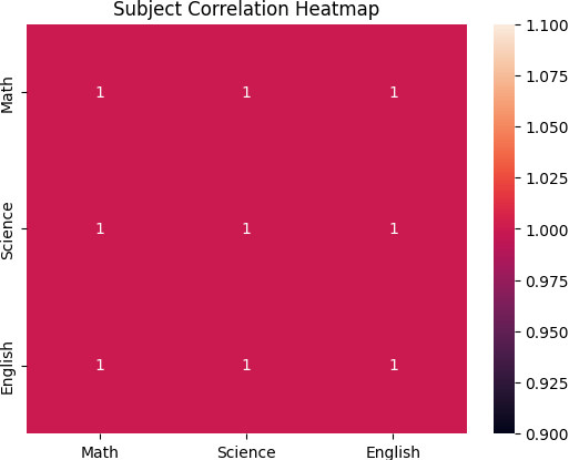
Explanation:
- Created a DataFrame with grades in different subjects.
- Calculated the correlation matrix using df.corr().
- Used sns.heatmap() to plot the correlation matrix, adding annotations to show correlation values.
- Displayed the heatmap with a title.
For more Practice: Solve these Related Problems:
- Write a Pandas program to create a heatmap of a correlation matrix from a DataFrame using a custom color gradient.
- Write a Pandas program to generate a heatmap with annotated cells that display the correlation values.
- Write a Pandas program to create a clustered heatmap that groups similar rows and columns based on a similarity metric.
- Write a Pandas program to produce a heatmap from pivot table data and customize both the x- and y-axis labels.
Go to:
PREV : Pair Plot with Seaborn.
NEXT : Pie Chart using Pandas and Matplotlib.
Python-Pandas Code Editor:
Have another way to solve this solution? Contribute your code (and comments) through Disqus.
What is the difficulty level of this exercise?
Test your Programming skills with w3resource's quiz.