Pandas Excel: Draw a bar plot, where each bar will represent one of the top 10 production
23. Bar Plot of Top 10 Production
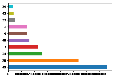
Write a Pandas program to import given excel data (coalpublic2013.xlsx) into a dataframe and draw a bar plot where each bar will represent one of the top 10 production. Go to Excel data
Sample Solution:
Python Code :
import pandas as pd
import numpy as np
import matplotlib.pyplot as plt
df = pd.read_excel('E:\coalpublic2013.xlsx')
sorted_by_production = df.sort_values(['Production'], ascending=False).head(10)
sorted_by_production['Production'].head(10).plot(kind="barh")
plt.show()
Sample Output:
Excel Data:
coalpublic2013.xlsx:
For more Practice: Solve these Related Problems:
- Write a Pandas program to import coalpublic2013.xlsx, compute the top 10 production values, and plot a bar chart.
- Write a Pandas program to group production data by MSHA ID, select the top 10 producers, and visualize them using a bar plot.
- Write a Pandas program to extract the top 10 production records from the Excel file and generate a corresponding bar chart.
- Write a Pandas program to sort production values in descending order, select the top 10, and display them as a bar chart.
Go to:
PREV : Combine Three Datasheets into a Single DataFrame.
NEXT : Bar Plot Comparing Multiple Metrics.
Have another way to solve this solution? Contribute your code (and comments) through Disqus.
What is the difficulty level of this exercise?
Test your Programming skills with w3resource's quiz.