Pandas Excel: Draw a bar plot comparing year, MSHA ID, Production and Labor_hours of first ten records
24. Bar Plot Comparing Multiple Metrics
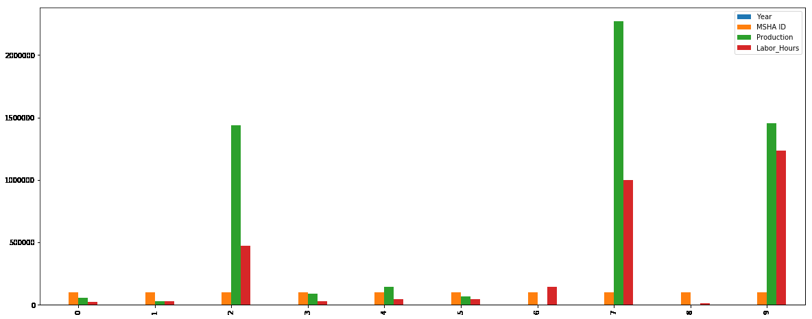
Write a Pandas program to import given excel data (coalpublic2013.xlsx ) into a dataframe and draw a bar plot comparing year, MSHA ID, Production and Labor_hours of first ten records. Go to Excel data
Sample Solution:
Python Code :
import pandas as pd
import numpy as np
import matplotlib.pyplot as plt
df = pd.read_excel('E:\coalpublic2013.xlsx')
df.head(10).plot(kind='bar', figsize=(20,8))
plt.show()
Sample Output:
Excel Data:
coalpublic2013.xlsx:
For more Practice: Solve these Related Problems:
- Write a Pandas program to import coalpublic2013.xlsx and draw a bar plot comparing year, MSHA ID, Production, and Labor_hours for the first ten records.
- Write a Pandas program to visualize multiple metrics from the Excel data by plotting a grouped bar chart for the first ten entries.
- Write a Pandas program to extract the first ten rows of coalpublic2013.xlsx and create a bar chart comparing key production metrics.
- Write a Pandas program to generate a multi-metric bar plot from the Excel data for a subset of records, comparing production and labor hours.
Go to:
PREV : Bar Plot of Top 10 Production.
NEXT : Export Combined Datasheets to a New Excel File.
Have another way to solve this solution? Contribute your code (and comments) through Disqus.
What is the difficulty level of this exercise?
Test your Programming skills with w3resource's quiz.